0、引用文章
1、在components中创建一个mymodal的文件夹
需要引入一个富文本的解析器
参考文章:vue admin 搭建
搜索:2023-10-08
创建组件
MyModalTitleComfirm.vue(带标题的二次确认弹框)
<template>
	<view>
		<tui-modal class="tui-modal" :show="props.modal" custom padding="0rpx">
			<view class="my-modal-custom">
				<view class="my-modal-title">{{props.title}}</view>
				<scroll-view scroll-y="true" class="my-modal">
					<v-md-preview class="my-modal-text" :text="props.content"></v-md-preview>
					<!-- <strong class="my-modal-text">{{props.content}}</strong> -->
				</scroll-view>
				<view class="my-modal-button-box">
					<view class="my-modal-cancal" @click="hideModal">
						<span class="my-modal-span">{{props.leftButtonText}}</span>
					</view>
					<view class="vertical-line"></view>
					<view class="my-modal-sure" @click="sureModal">
						<span class="my-modal-span">{{props.rightButtonText}}</span>
					</view>
				</view>
			</view>
		</tui-modal>
	</view>
</template>

<script setup>
	import {ref,defineEmits} from 'vue'

	const emit = defineEmits(['hideModal','sureModal'])

	// 取消按钮
	const hideModal = () =>{
		emit('hideModal')
	}

	// 确定按钮
	const sureModal = () =>{
		emit('sureModal')
	}

 const props = defineProps({
	 //  内容信息
	 "content":{
		 type:String,
		 default:"",
		 required: true
	 },
	 //控制显隐
	 "modal":{
	 		 type:Boolean,
	 		 default:false,
	 		 required: true
	 },
	 //标题
	 "title":{
	 		 type:String,
	 		 default:'提示',
	 		 required: true
	 },
	 //左边按钮名称
	 "leftButtonText":{
	 		 type:String,
	 		 default:'取消',
	 		 required: false
	 },
	 //右边按钮名称
	 "rightButtonText":{
	 		 type:String,
	 		 default:'确认',
	 		 required: false
	 },
	 //高度
	 "height":{
	 		 type:String,
	 		 default:'602rpx',
	 		 required: false
	 }
 })

	const handleClick = (e) =>{
		let index = e.index;
		if (index === 0) {
			console.log('你点击了取消按钮');
		} else {
			console.log('你点击了确定按钮');
		}
		hideModal();
	}
</script>

<style lang="scss" scoped>

	.tui-modal{
		display: flex;
		justify-content: center;
		align-items: center;
	}

	/* 弹窗 */
	.my-modal-custom{
		display: flex;
		flex-direction: column;
		flex-wrap: wrap;
		justify-content: center;
		align-items: center;

		width: 100%;
		// height: 100%;

		.my-modal-title{
			// width: 360rpx;
			// height: 56rpx;
			font-size: 40rpx;
			font-family: PingFangSC, PingFang SC;
			font-weight: 550;
			color: rgba(0,24,26,0.85);
			line-height: 56rpx;

			margin-top: 50rpx;
		}

		.my-modal{
			--textHeight: v-bind(props.height);
			// width: 602rpx;
			width: 100%;
			height: var(--textHeight);
			box-shadow: inset 0rpx -2rpx 0rpx 0rpx #EEEEEE;

			display: flex;
			justify-content: flex-start;
			align-items: flex-start;

			// padding-top: -30rpx;

			.my-modal-text{
				width: 100%;
				// height: 56rpx;
				font-size: 40rpx;
				font-family: PingFangSC-Medium, PingFang SC;
				font-weight: 549;
				color: rgba(0,24,26,0.85);
				line-height: 56rpx;


			}

		}

		.my-modal-button-box{
			display: flex;
			flex-direction: row;
			flex-wrap: nowrap;
			justify-content: center;
			align-items: center;

			width: 100%;

			box-shadow: inset 0rpx 2rpx 0rpx 0rpx #EEEEEE;

			.my-modal-cancal{
				display: flex;
				justify-content: center;
				align-items: center;

				width: 301rpx;
				height: 100rpx;
			}

			.my-modal-cancal:active{
					background-color: rgb(229, 229, 229);
			}

			.vertical-line {
				width: 2rpx;
				height: 100rpx;
				background: #EEEEEE;

				// margin-left: 100rpx;
				// margin-right: 100rpx;
			}

			.my-modal-sure{
				display: flex;
				justify-content: center;
				align-items: center;

				width: 301rpx;
				height: 100rpx;
			}

			.my-modal-sure:active{
					background-color: rgb(229, 229, 229);
			}

			.my-modal-span{
				width: 68rpx;
				height: 48rpx;
				font-size: 34rpx;
				font-family: PingFangSC-Regular, PingFang SC;
				font-weight: 400;
				color: #74BDB0;
				line-height: 48rpx;
			}
		}
	}

</style>
使用:
<template>
<view>
<view @click="submitTitleClick">
测试
</view>
<MyModalTitleComfirm :modal="confirmTitleShowModal" :title="confirmTitleValue" :height="confirmTitleHeight" :content="confirmTitleContent" @hideModal="confirmTitleHideModal" @sureModal="submitTitleRequest"></MyModalTitleComfirm>
</view>
</template>
<script setup>
import {ref} from 'vue';
import MyModalTitleComfirm from '@/components/mymodal/MyModalTitleComfirm.vue'
// 弹窗
const confirmTitleShowModal = ref(false)
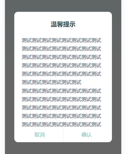
const confirmTitleValue = ref('注销账号')
const confirmTitleContent = ref("<span style='word-break:break-all;width:100%;'>注销账号,您账号下的普通用户和咨询师身份的所有数据将会被彻底清除,不可恢复。<span style='color:red'>请谨慎操作!</span></span>")
const confirmTitleHeight = ref('288rpx')
// 隐藏
const confirmTitleHideModal = () =>{
confirmTitleShowModal.value = false
}
// 点击显示
const submitTitleClick = () =>{
confirmTitleShowModal.value = true
}
// 二次确认请求
const submitTitleRequest = async () =>{
uni.showLoading({
title: '加载中'
});
//你的请求业务代码
uni.hideLoading();
confirmTitleShowModal.value = false
}
</script>
<style scoped>
</style>效果:
2、MyModalSingleComfirm.vue(单个确认按钮的弹框)
<template>
	<view>
		<tui-modal class="tui-modal" :show="props.modal" custom padding="0rpx">
			<view class="my-modal-custom">
				<view class="my-modal">
					<span class="my-modal-text" v-html="props.myTip"></span>
				</view>
				<view class="my-modal-button-box">
					<view class="my-modal-sure" @click="sureModal">
						<span class="my-modal-span">确认</span>
					</view>
				</view>
			</view>
		</tui-modal>
	</view>
</template>

<script setup>
	import {ref,defineEmits} from 'vue'

	const emit = defineEmits(['sureModal'])

	// 确定按钮
	const sureModal = () =>{
		emit('sureModal')
	}

 const props = defineProps({
	 //  提示信息
	 "myTip":{
		 type:String,
		 default:"",
		 required: true
	 },
	 //控制显隐
	 "modal":{
	 		 type:Boolean,
	 		 default:false,
	 		 required: true
	 }
 })

</script>

<style lang="scss" scoped>

	.tui-modal{
		display: flex;
		justify-content: center;
		align-items: center;
	}

	/* 弹窗 */
	.my-modal-custom{
		display: flex;
		flex-direction: column;
		flex-wrap: wrap;
		justify-content: center;
		align-items: center;

		width: 100%;
		height: 100%;

		.my-modal{
			// width: 602rpx;
			width: 100%;
			height: 208rpx;
			box-shadow: inset 0rpx -2rpx 0rpx 0rpx #EEEEEE;

			display: flex;
			justify-content: center;
			align-items: center;

			.my-modal-text{
				width: 90%;
				// height: 84rpx;
				font-size: 30rpx;
				font-family: PingFangSC, PingFang SC;
				font-weight: 400;
				color: rgba(0,24,26,0.85);
				line-height: 42rpx;
			}

		}

		.my-modal-button-box{
			display: flex;
			flex-direction: row;
			flex-wrap: nowrap;
			justify-content: center;
			align-items: center;

			.my-modal-sure{
				display: flex;
				justify-content: center;
				align-items: center;

				width: 602rpx;
				height: 100rpx;
			}

			.my-modal-sure:active{
					background-color: rgb(229, 229, 229);
			}

			.my-modal-span{
				width: 68rpx;
				height: 48rpx;
				font-size: 34rpx;
				font-family: PingFangSC-Regular, PingFang SC;
				font-weight: 400;
				color: #74BDB0;
				line-height: 48rpx;
			}
		}
	}

</style>
使用:
<MyModalSingleComfirm :modal="confirmShowModal" :myTip="confirmMyTip" @sureModal="submitRequest"></MyModalSingleComfirm>

import {ref} from 'vue'

	// 弹窗
	 const confirmShowModal = ref(false)

	 const confirmMyTip = ref('你的咨询订单将在今天的<span style="color:#44B29F">21:00</span>开始,请准时进入咨询室.')

	 // 点击显示
	 const submitClick = () =>{
		 confirmShowModal.value = true
	 }


	 // 二次确认请求
	 const submitRequest = () =>{
		 uni.showLoading({
				title: '加载中'
			 });
		//你的请求业务代码
		uni.hideLoading();
		confirmShowModal.value = false
	}
效果:
2023-11-30 start
3、MyModalCustomComfirm.vue(自定义弹框内容)
<template>
	<view>
		<tui-modal class="tui-modal" :show="props.modal" custom padding="0rpx">
			<view class="my-modal-custom">
				<view class="my-modal-title">{{props.title}}</view>
				<view class="my-modal">
					<slot>
						<strong class="my-modal-text">{{props.myTip}}</strong>
					</slot>
				</view>
				<view class="my-modal-button-box">
					<view class="my-modal-cancal" @click="hideModal">
						<span class="my-modal-span">取消</span>
					</view>
					<view class="vertical-line"></view>
					<view class="my-modal-sure" @click="sureModal">
						<span class="my-modal-span">确认</span>
					</view>
				</view>
			</view>
		</tui-modal>
	</view>
</template>

<script setup>
	import {ref,defineEmits} from 'vue'

	const emit = defineEmits(['hideModal','sureModal'])

	// 取消按钮
	const hideModal = () =>{
		emit('hideModal')
	}

	// 确定按钮
	const sureModal = () =>{
		emit('sureModal')
	}

 const props = defineProps({
	 //  提示信息
	 "myTip":{
		 type:String,
		 default:"",
		 required: true
	 },
	 //控制显隐
	 "modal":{
	 		 type:Boolean,
	 		 default:false,
	 		 required: true
	 },
	 //标题
	 "title":{
	 		 type:String,
	 		 default:'提示',
	 		 required: false
	 },
 })

	const handleClick = (e) =>{
		let index = e.index;
		if (index === 0) {
			console.log('你点击了取消按钮');
		} else {
			console.log('你点击了确定按钮');
		}
		hideModal();
	}
</script>

<style lang="scss" scoped>

	.tui-modal{
		display: flex;
		justify-content: center;
		align-items: center;
	}

	/* 弹窗 */
	.my-modal-custom{
		display: flex;
		flex-direction: column;
		flex-wrap: wrap;
		justify-content: center;
		align-items: center;

		width: 100%;
		height: 100%;

		.my-modal-title{
			// width: 360rpx;
			// height: 56rpx;
			font-size: 40rpx;
			font-family: PingFangSC, PingFang SC;
			font-weight: 550;
			color: rgba(0,24,26,0.85);
			line-height: 56rpx;

			margin-top: 50rpx;
		}

		.my-modal{
			// width: 602rpx;
			width: 100%;
			height: 246rpx;
			box-shadow: inset 0rpx -2rpx 0rpx 0rpx #EEEEEE;

			display: flex;
			justify-content: center;
			align-items: center;

			.my-modal-text{
				/* width: 360rpx; */
				height: 56rpx;
				font-size: 40rpx;
				font-family: PingFangSC-Medium, PingFang SC;
				font-weight: 549;
				color: rgba(0,24,26,0.85);
				line-height: 56rpx;
			}

		}

		.my-modal-button-box{
			display: flex;
			flex-direction: row;
			flex-wrap: nowrap;
			justify-content: center;
			align-items: center;

			.my-modal-cancal{
				display: flex;
				justify-content: center;
				align-items: center;

				width: 301rpx;
				height: 100rpx;
			}

			.my-modal-cancal:active{
					background-color: rgb(229, 229, 229);
			}

			.vertical-line {
				width: 2rpx;
				height: 100rpx;
				background: #EEEEEE;

				// margin-left: 100rpx;
				// margin-right: 100rpx;
			}

			.my-modal-sure{
				display: flex;
				justify-content: center;
				align-items: center;

				width: 301rpx;
				height: 100rpx;
			}

			.my-modal-sure:active{
					background-color: rgb(229, 229, 229);
			}

			.my-modal-span{
				width: 68rpx;
				height: 48rpx;
				font-size: 34rpx;
				font-family: PingFangSC-Regular, PingFang SC;
				font-weight: 400;
				color: #74BDB0;
				line-height: 48rpx;
			}
		}
	}

</style>
使用:
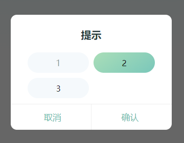
<MyModalCustomComfirm :modal="confirmCustomShowModal" :title="customTitle" :myTip="confirmCustomMyTip" @hideModal="confirmCustomHideModal" @sureModal="submitCustomRequest">
<view class="custom-box">
<view :class="{'item-box-ed':selectedId===1,'item-box':selectedId!==1}" @click="selectedClick(1)">
<span class="item-span">1</span>
</view>
<view :class="{'item-box-ed':selectedId===2,'item-box':selectedId!==2}" @click="selectedClick(2)">
<span class="item-span">2</span>
</view>
<view :class="{'item-box-ed':selectedId===3,'item-box':selectedId!==3}" @click="selectedClick(3)">
<span class="item-span">3</span>
</view>
</view>
</MyModalCustomComfirm>
// 弹窗
const confirmCustomShowModal = ref(false)
// 标题
const customTitle = ref('提示')
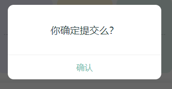
const confirmCustomMyTip = ref('你确定提交么?')
// 隐藏
const confirmCustomHideModal = () =>{
confirmShowModal.value = false
}
// 点击显示
const submitCustomClick = () =>{
confirmShowModal.value = true
}
// 选择的标签
const selectedId = ref(0)
const selectedClick = (id) => {
selectedId.value = id
}
// 二次确认请求
const submitCustomRequest = async () =>{
uni.showLoading({
title: '加载中'
});
//你的请求业务代码
confirmCustomShowModal.value = false
uni.hideLoading();
}
<style lang="scss" scoped>
.custom-box{
display: flex;
flex-direction: row;
flex-wrap: wrap;
justify-content: space-between;
align-items: flex-start;
width: 79%;
.item-box{
width: 240rpx;
height: 80rpx;
background: #F5F9FC;
border-radius: 40rpx;
display: flex;
justify-content: center;
align-items: center;
margin-top: 20rpx;
.item-span{
// width: 136rpx;
// height: 48rpx;
font-size: 34rpx;
font-family: PingFangSC, PingFang SC;
font-weight: 400;
color: rgba(0,24,26,0.45);
line-height: 48rpx;
}
}
.item-box-ed{
width: 240rpx;
height: 80rpx;
background: linear-gradient(145deg, #AADEB8 0%, #7AC7BA 100%);
box-shadow: 0rpx 2rpx 4rpx 2rpx rgba(255,255,255,0.5);
border-radius: 40rpx;
display: flex;
justify-content: center;
align-items: center;
margin-top: 20rpx;
.item-span{
// width: 68rpx;
// height: 48rpx;
font-size: 34rpx;
font-family: PingFangSC, PingFang SC;
font-weight: 500;
color: #FFFFFF;
line-height: 48rpx;
}
}
}
</style>如图:
end
2023-12-06 start
组件:
end
2024-04-22 start
end