1、在components文件夹中(没有就创建)创建一个CustomTabBar.vue组件
CustomTabBar.vue:
<template>
  <view class="custom-tab-bar">
    <view
      v-for="(tab, index) in tabs"
      :key="index"
      @click="selectTab(tab,index)"
      :class="{ active: activeTab === index }"
    >
      {{ tab.title }}
    </view>
  </view>
</template>

<script>
export default {
  props: {
	current: {
	  type: [Number, String],
	  default: 0
	}
  },
  data() {
    return {
      tabs: [
	    {
		  icon: 'icon-home',
		  iconActive: 'icon-home-hl',
		  title: '首页',
		  path: '../index/index'
		},
        {
          icon: 'icon-home',
          iconActive: 'icon-home-hl',
          title: '其他',
          path: '../home/home'
        }
      ],
      activeTab: this.current,
    };
  },
  methods: {
    selectTab(tab,index) {
      this.activeTab = index;
      // 这里可以触发切换页面内容的逻辑
	  uni.redirectTo({
	  	url:tab.path
	  })
    },
  },
};
</script>

<style scoped>
.custom-tab-bar {
  display: flex;

  justify-content: center; /* 水平居中 */
  position: fixed;
  bottom: 20rpx; /* 距离底部 20rpx */
  width: 90%; /* 宽度 90% */
  background-color: #fff; /* 设置背景颜色,可根据需要修改 */
}

.custom-tab-bar > view {
  flex: 1;
  text-align: center;
  padding: 10px;
  cursor: pointer;
  border: 1px solid #ccc;
}

.custom-tab-bar > view.active {
  background-color: #007bff;
  color: #fff;
}
</style>
vue3:
<template>
  <view class="custom-tab-bar">
    <view
      v-for="(tab, index) in tabs"
      :key="index"
      @click="selectTab(tab,index)"
      :class="{ active: activeTab === index }"
    >
      {{ tab.title }}
    </view>
  </view>
</template>

<script setup>
	import {ref} from 'vue'
	 const props = defineProps({
		 // 长度
		"current": {
			  type: [Number, String],
			  default: 0,
			  required: false
		  }
	 })
	 const tabs = ref([
		{
		  icon: 'icon-home',
		  iconActive: 'icon-home-hl',
		  title: '首页',
		  path: '../home/index'
		},
		 {
		   icon: 'icon-home',
		   iconActive: 'icon-home-hl',
		   title: '我的',
		   path: '../mine/index'
		 }
	 ])
	 const activeTab = ref()
	 activeTab.value = props.current

	 const selectTab = (tab,index) =>{
	   activeTab.value = index;
	   // 这里可以触发切换页面内容的逻辑
		  uni.redirectTo({
			url:tab.path
		  })
	 }
</script>

<style scoped>
.custom-tab-bar {
  display: flex;

  justify-content: center; /* 水平居中 */
  position: fixed;
  bottom: 20rpx; /* 距离底部 20rpx */
  width: 90%; /* 宽度 90% */
  background-color: #fff; /* 设置背景颜色,可根据需要修改 */
}

.custom-tab-bar > view {
  flex: 1;
  text-align: center;
  padding: 10px;
  cursor: pointer;
  border: 1px solid #ccc;
}

.custom-tab-bar > view.active {
  background-color: #007bff;
  color: #fff;
}
</style>
然后再page的页面上,如index页面添加组件
index.vue:
<template>
  <div>
    <!-- 页面内容 -->
	index
	<view class="tabbar-box">
		<CustomTabBar :current="0" :style="{ width: '90%' }" />
	</view>
  </div>
</template>

<script>
import CustomTabBar from '@/components/CustomTabBar.vue';

export default {
  components: {
    CustomTabBar,
  },
};
</script>

<style scoped>
	.tabbar-box{
		width: 100%;
		display: flex;
		justify-content: center;
		z-index: 999;
	}
</style>
home.vue:
<template>
<div>
<!-- 页面内容 -->
home
<view class="tabbar-box">
<CustomTabBar :current="0" :style="{ width: '90%' }" />
</view>
</div>
</template>
<script>
import CustomTabBar from '@/components/CustomTabBar.vue';
export default {
components: {
CustomTabBar,
},
};
</script>
<style scoped>
.tabbar-box{
width: 100%;
display: flex;
justify-content: center;
z-index: 999;
}
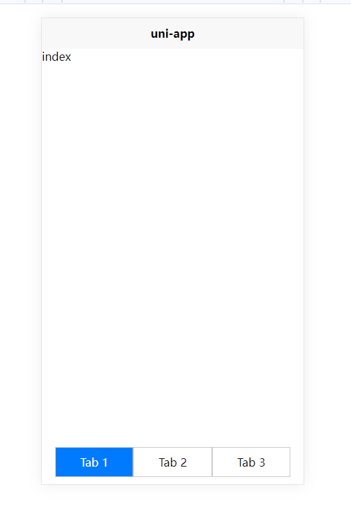
</style>运行如图:
参考文章:
H5版基于uni-app实现自定义底部tabbar效果(支持底部图标选中时的渐变效果)