App.jsx:
import { useEffect, useState } from 'react'
import mod from './styles/module-demo.module.css'
import './App.css'
export default function App() {
const [count, setCount] = useState(0)
const [moduleOn, setModuleOn] = useState(false)
useEffect(() => {
document.title = 'React 样式示例'
}, [])
return (
<main className="style-app">
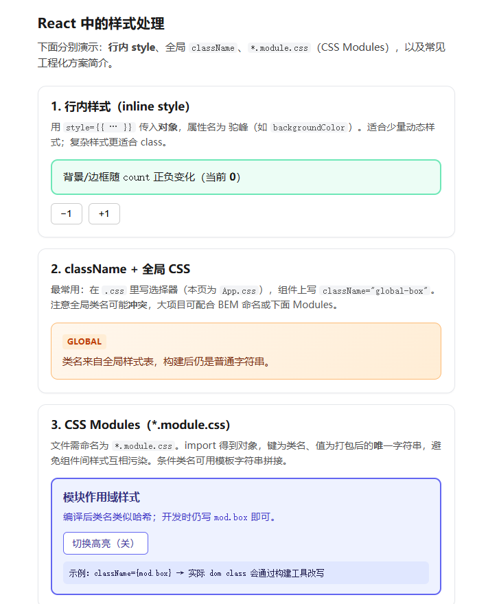
<h1 className="style-app__title">React 中的样式处理</h1>
<p className="style-app__intro">
下面分别演示:<strong>行内 style</strong>、全局 <code>className</code>、
<code>*.module.css</code>(CSS Modules),以及常见工程化方案简介。
</p>
<section className="style-section">
<h2>1. 行内样式(inline style)</h2>
<p className="style-hint">
用 <code>style={{ … }}</code> 传入<strong>对象</strong>,属性名为
驼峰(如 <code>backgroundColor</code>)。适合少量动态样式;复杂样式更适合 class。
</p>
<div
style={{
padding: '12px 16px',
borderRadius: 10,
backgroundColor: count >= 0 ? '#ecfdf5' : '#fef2f2',
border: `2px solid ${count >= 0 ? '#6ee7b7' : '#fca5a5'}`,
transition: 'background-color 0.2s, border-color 0.2s',
}}
>
<p style={{ margin: 0, fontSize: '0.95rem' }}>
背景/边框随 <code>count</code> 正负变化(当前 <strong>{count}</strong>)
</p>
</div>
<div className="style-actions">
<button type="button" onClick={() => setCount((c) => c - 1)}>
−1
</button>
<button type="button" onClick={() => setCount((c) => c + 1)}>
+1
</button>
</div>
</section>
<section className="style-section">
<h2>2. className + 全局 CSS</h2>
<p className="style-hint">
最常用:在 <code>.css</code> 里写选择器(本页为 <code>App.css</code>),组件上写{' '}
<code>className="global-box"</code>。注意全局类名可能<strong>冲突</strong>,大项目可配合
BEM 命名或下面 Modules。
</p>
<div className="global-box">
<span className="global-box__tag">Global</span>
<p className="global-box__text">类名来自全局样式表,构建后仍是普通字符串。</p>
</div>
</section>
<section className="style-section">
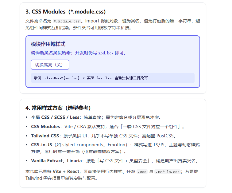
<h2>3. CSS Modules(*.module.css)</h2>
<p className="style-hint">
文件需命名为 <code>*.module.css</code>。import 得到对象,键为类名、值为打包后的<strong>唯一</strong>
字符串,避免组件间样式互相污染。条件类名可用模板字符串拼接。
</p>
<div className={mod.box}>
<p className={mod.title}>模块作用域样式</p>
<p className={mod.text}>
编译后类名类似哈希;开发时仍写 <code>mod.box</code> 即可。
</p>
<div className={mod.toggleRow}>
<button
type="button"
className={`${mod.btn} ${moduleOn ? mod.btnActive : ''}`}
onClick={() => setModuleOn((v) => !v)}
>
切换高亮({moduleOn ? '开' : '关'})
</button>
</div>
<p className={mod.hashline}>
示例:<code>className={mod.box}</code> → 实际 dom class 会通过构建工具改写
</p>
</div>
</section>
<section className="style-section">
<h2>4. 常用样式方案(选型参考)</h2>
<ul className="style-list">
<li>
<strong>全局 CSS / SCSS / Less</strong>:简单直接;需约定命名或分层避免冲突。
</li>
<li>
<strong>CSS Modules</strong>:Vite / CRA 默认支持;适合「一套 CSS 文件对应一个组件」。
</li>
<li>
<strong>Tailwind CSS</strong>:原子类拼 UI,几乎不写单独 CSS 文件;需配置 PostCSS。
</li>
<li>
<strong>CSS-in-JS</strong>(如 styled-components、Emotion):样式写进 TS/JS,主题与动态样式方便,运行时有一定开销(也有静态提取方案)。
</li>
<li>
<strong>Vanilla Extract、Linaria</strong>:接近「写 CSS 文件 + 类型安全」,构建期产出真实类名。
</li>
</ul>
<p className="style-hint" style={{ marginBottom: 0 }}>
本仓库已具备 <strong>Vite + React</strong>,可直接使用行内样式、任意 <code>.css</code> 与{' '}
<code>.module.css</code>;若要接 Tailwind 需在项目里单独安装与配置。
</p>
</section>
</main>
)
}
App.css:
/* 页面布局(全局 className) */
.style-app {
  max-width: 38rem;
  margin: 0 auto;
  padding: 2rem 1.25rem 2.5rem;
  font-family: system-ui, sans-serif;
  line-height: 1.55;
  color: #1a1a1a;
}

.style-app__title {
  font-size: 1.28rem;
  font-weight: 650;
  margin: 0 0 0.5rem;
}

.style-app__intro {
  margin: 0 0 1.35rem;
  font-size: 0.92rem;
  color: #444;
}

.style-app__intro code {
  font-size: 0.88em;
  background: #f3f4f6;
  padding: 0.06em 0.32em;
  border-radius: 4px;
}

.style-section {
  border: 1px solid #e5e7eb;
  border-radius: 12px;
  padding: 1rem 1.15rem 1.15rem;
  margin-bottom: 1rem;
  background: #fff;
  box-shadow: 0 1px 2px rgb(0 0 0 / 4%);
}

.style-section h2 {
  font-size: 1.05rem;
  font-weight: 600;
  margin: 0 0 0.45rem;
}

.style-hint {
  margin: 0 0 0.85rem;
  font-size: 0.88rem;
  color: #555;
}

.style-hint code {
  font-size: 0.9em;
  background: #f3f4f6;
  padding: 0.06em 0.32em;
  border-radius: 4px;
}

.style-actions {
  display: flex;
  gap: 0.6rem;
  margin-top: 0.75rem;
}

.style-actions button {
  padding: 0.4rem 0.85rem;
  font-size: 0.9rem;
  cursor: pointer;
  border: 1px solid #ccc;
  border-radius: 6px;
  background: #fff;
}

.style-actions button:hover {
  background: #f9fafb;
}

/* BEM 风格全局块:避免与普通 .box 混淆 */
.global-box {
  padding: 0.85rem 1rem;
  border-radius: 10px;
  background: linear-gradient(135deg, #fff7ed 0%, #ffedd5 100%);
  border: 1px solid #fdba74;
}

.global-box__tag {
  display: inline-block;
  font-size: 0.72rem;
  font-weight: 700;
  letter-spacing: 0.04em;
  text-transform: uppercase;
  color: #c2410c;
  background: #ffedd5;
  padding: 0.15rem 0.45rem;
  border-radius: 4px;
  margin-bottom: 0.4rem;
}

.global-box__text {
  margin: 0;
  font-size: 0.92rem;
  color: #7c2d12;
}

.style-list {
  margin: 0 0 0.85rem;
  padding-left: 1.15rem;
  font-size: 0.9rem;
  color: #374151;
}

.style-list li {
  margin-bottom: 0.45rem;
}

.style-list li strong {
  font-weight: 600;
}
module-demo.module.css:
.box {
  padding: 0.85rem 1rem;
  border-radius: 10px;
  border: 2px solid #6366f1;
  background: #eef2ff;
}

.title {
  margin: 0 0 0.35rem;
  font-size: 1rem;
  font-weight: 650;
  color: #312e81;
}

.text {
  margin: 0;
  font-size: 0.9rem;
  color: #4338ca;
}

.toggleRow {
  margin-top: 0.65rem;
  display: flex;
  gap: 0.5rem;
  flex-wrap: wrap;
  align-items: center;
}

.btn {
  padding: 0.35rem 0.75rem;
  font-size: 0.88rem;
  cursor: pointer;
  border: 1px solid #6366f1;
  border-radius: 6px;
  background: #fff;
  color: #3730a3;
}

.btnActive {
  background: #4338ca;
  color: #fff;
  border-color: #4338ca;
}

.hashline {
  margin: 0.65rem 0 0;
  padding: 0.45rem 0.55rem;
  font-family: ui-monospace, monospace;
  font-size: 0.75rem;
  word-break: break-all;
  background: #e0e7ff;
  border-radius: 6px;
  color: #1e1b4b;
}
相关知识点总结:
行内样式:使用 style={{ }} 传入JS 对象,属性采用驼峰命名(如 backgroundColor),适合简单动态样式

全局 CSS:通过 className 绑定类名,引入普通 .css 文件,简单易用但存在类名冲突风险

CSS Modules:文件命名为 .module.css,通过对象调用类名,编译后自动生成唯一类名,完美解决样式污染

动态样式:可通过状态判断动态修改 style 或 className,实现交互样式变化

样式方案:支持全局 CSS、CSS Modules、Tailwind CSS、CSS-in-JS 等多种工程化方案

核心优势:CSS Modules 是组件化开发最推荐的样式方案,兼顾易用性与隔离性