App.jsx:
import { useEffect, useState } from 'react'
import Badge from './components/Badge.jsx'
import HighlightCard from './components/HighlightCard.jsx'
import PageSection from './components/PageSection.jsx'
import './App.css'
export default function App() {
const [count, setCount] = useState(0)
useEffect(() => {
document.title = '拆分 · 复用 · 嵌套'
}, [])
return (
<main className="app">
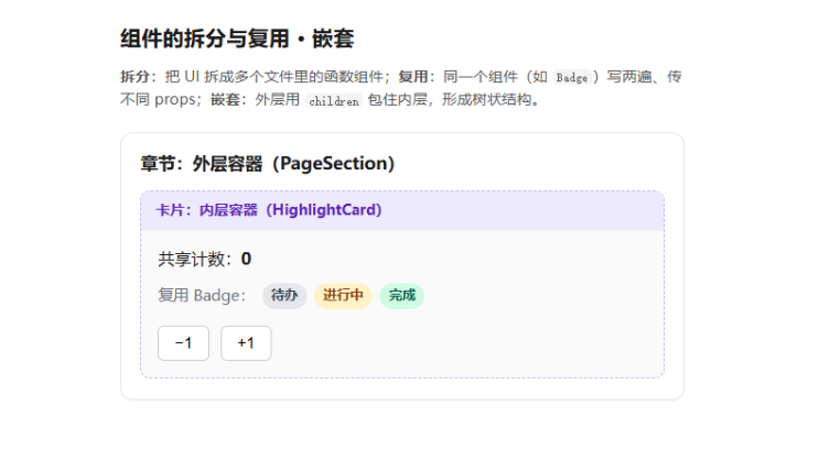
<h1>组件的拆分与复用 · 嵌套</h1>
<p className="hint">
<strong>拆分</strong>:把 UI 拆成多个文件里的函数组件;<strong>复用</strong>
:同一个组件(如 <code>Badge</code>)写两遍、传不同 props;
<strong>嵌套</strong>:外层用 <code>children</code> 包住内层,形成树状结构。
</p>
{/* App → PageSection → HighlightCard → 文本 / Badge / 计数器 */}
<PageSection title="章节:外层容器(PageSection)">
<HighlightCard label="卡片:内层容器(HighlightCard)">
<p className="count">
共享计数:<strong>{count}</strong>
</p>
<p className="badge-row">
<span className="muted">复用 Badge:</span>
<Badge text="待办" />
<Badge text="进行中" tone="warn" />
<Badge text="完成" tone="ok" />
</p>
<div className="actions">
<button type="button" onClick={() => setCount((c) => c - 1)}>
−1
</button>
<button type="button" onClick={() => setCount((c) => c + 1)}>
+1
</button>
</div>
</HighlightCard>
</PageSection>
</main>
)
}
Badge.jsx:
export default function Badge({ text, tone = 'default' }) {
  return <span className={`badge badge--${tone}`}>{text}</span>
}
HighlightCard.jsx:
export default function HighlightCard({ label, children }) {
  return (
    <article className="highlight-card">
      <header className="highlight-card__head">{label}</header>
      <div className="highlight-card__body">{children}</div>
    </article>
  )
}
PageSection.jsx:
export default function PageSection({ title, children }) {
  return (
    <section className="page-section">
      <h2 className="page-section__title">{title}</h2>
      <div className="page-section__body">{children}</div>
    </section>
  )
}
App.css:
.app {
  max-width: 34rem;
  margin: 0 auto;
  padding: 2rem 1.25rem 3rem;
  font-family: system-ui, sans-serif;
  line-height: 1.55;
  color: #1a1a1a;
}

.app > h1 {
  font-size: 1.28rem;
  font-weight: 650;
  margin: 0 0 0.65rem;
}

.hint {
  margin: 0 0 1.25rem;
  font-size: 0.9rem;
  color: #555;
}

.hint code {
  font-size: 0.85em;
  background: #f3f4f6;
  padding: 0.08em 0.35em;
  border-radius: 4px;
}

.page-section {
  border: 1px solid #e5e7eb;
  border-radius: 12px;
  padding: 1rem 1.15rem 1.2rem;
  background: #fff;
  box-shadow: 0 1px 2px rgb(0 0 0 / 5%);
}

.page-section__title {
  font-size: 1.05rem;
  font-weight: 600;
  margin: 0 0 0.85rem;
}

.page-section__body {
  margin: 0;
}

.highlight-card {
  border: 1px dashed #c4b5fd;
  border-radius: 10px;
  overflow: hidden;
  background: #fafafa;
}

.highlight-card__head {
  padding: 0.5rem 0.85rem;
  font-size: 0.88rem;
  font-weight: 600;
  color: #5b21b6;
  background: #ede9fe;
}

.highlight-card__body {
  padding: 0.95rem 1rem 1.05rem;
}

.count {
  margin: 0 0 0.65rem;
  font-size: 1rem;
}

.badge-row {
  display: flex;
  flex-wrap: wrap;
  align-items: center;
  gap: 0.45rem;
  margin: 0 0 1rem;
  font-size: 0.92rem;
}

.muted {
  color: #6b7280;
  width: 100%;
}

@media (min-width: 400px) {
  .muted {
    width: auto;
  }
}

.badge {
  display: inline-block;
  padding: 0.18rem 0.55rem;
  font-size: 0.8rem;
  font-weight: 600;
  border-radius: 999px;
  background: #e5e7eb;
  color: #374151;
}

.badge--warn {
  background: #fef3c7;
  color: #92400e;
}

.badge--ok {
  background: #d1fae5;
  color: #065f46;
}

.actions {
  display: flex;
  gap: 0.65rem;
}

.actions button {
  padding: 0.45rem 0.95rem;
  font-size: 0.95rem;
  cursor: pointer;
  border: 1px solid #ccc;
  border-radius: 6px;
  background: #fff;
}

.actions button:hover {
  background: #f9fafb;
}
相关知识点总结:
组件拆分:把复杂页面拆分为独立、单一职责的小组件(如 PageSection、HighlightCard),便于维护和管理

组件复用:同一个组件(如 Badge)多次使用,通过传递不同 props 实现差异化展示,减少重复代码

组件嵌套:外层组件通过 children 属性接收并渲染内层内容,形成组件树结构

组件导入导出:通过 import 引入子组件,在 JSX 中直接当作标签使用

props 传参:父组件向子组件传递数据 / 配置,实现组件灵活定制

状态提升:共享状态(count)定义在公共父组件中,向下传递给多个子组件共用

优势:代码结构清晰、易于维护、可复用性强、符合 React 组件化设计思想